Our Journey to Revolutionize Car Services.
Montyr is a comprehensive car service booking application that allows users to easily book and schedule an appointment.
Dec '21
to Present
Product
Designer
Sole Designer
Research, Wireframing, Low & High-fidelity Prototyping, Usability Studies, and Visual Design (UI).
Meet Sarah
Meet Sarah, a working professional in the heart of a bustling city. Sarah relied heavily on Rosie (her car) to navigate her busy life. Her days are a whirlwind of meetings, deadlines, and endless to-dos.
But there's one thing Sarah dreads – scheduling car service appointments. Calling workshops, waiting on hold, and uncertain availability seemed to be an inevitable part of car ownership.

"Customers like Sarah are currently required to either make phone calls or physically visit a workshop in order to secure a car service appointment. This process proves cumbersome, often resulting in difficulties in obtaining same-day appointments due to the existing limitations."
Sarah’s Scheduling Struggle
Why was traditional car service booking so frustrating? We mapped every step Sarah had to take.
"Sarah's journey highlights the challenges of the traditional process. The experience includes excessive phone calls, wait times, and a complete lack of real-time updates."
Sarah notices her car needs maintenance and decides to schedule a service appointment. She takes out her smartphone to start researching options.

She reads online reviews to gauge the reputation of different service centers and compiles a list of potential providers based on her research.

She encounters automated phone menus, long hold times, and leaves voicemails at several places — with no guarantee of a callback.

Sarah contacts a service center but struggles to find a suitable appointment date due to her busy schedule, leading to indecision and multiple back-and-forth exchanges.

On the appointment day, Sarah drives to the service centre, only to learn her car won't be ready until the next day. She calls multiple times for status updates and reassurance.

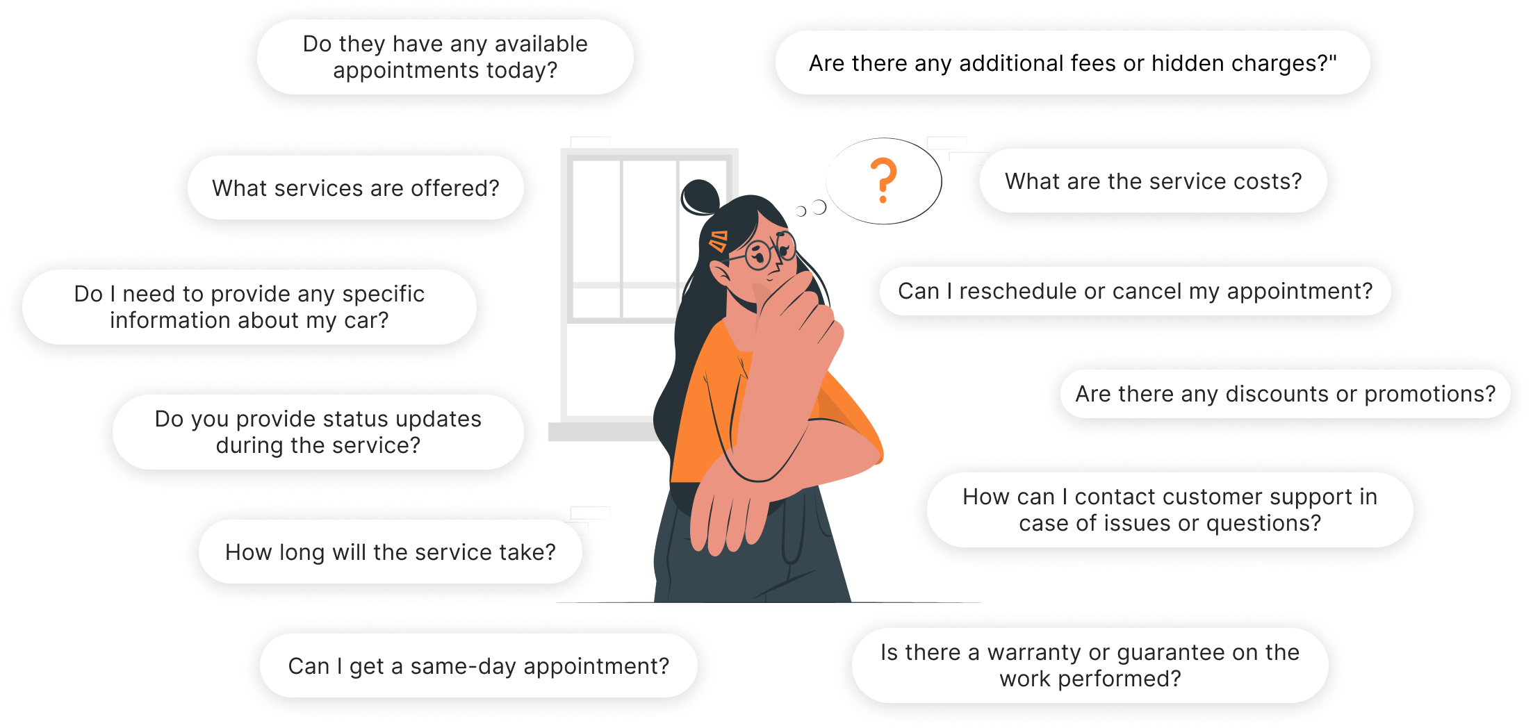
Sarah's Curiosity
Exploring the Road of Questions. These questions reflect the common concerns users have when booking car services through traditional methods, highlighting the need for a more user-friendly and transparent booking process.
Innovation in Action
We were determined to change the game, not just for Sarah but for everyone facing this ordeal. With a vision of simplifying car service booking, we embarked on a journey to create an app that would make the process as easy as ordering your favourite takeout.
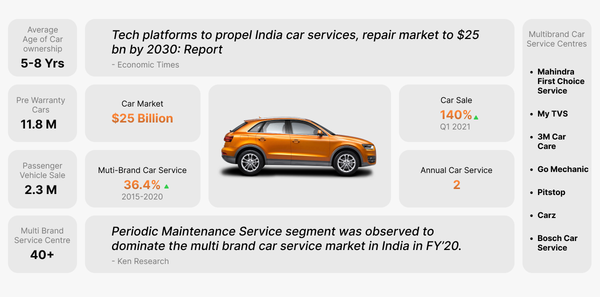
Harnessing Data
Delving into the vast sea of data proved to be a game-changer. It allowed me to decode the market intricacies and unveil the pressing need for a user-friendly car service app.
What's Broken?
Three core problems emerged clearly from our user interviews and research.
Pricing Opacity
Users have no visibility into costs before committing. Uncertainty around pricing is a major source of frustration.
Time-Consuming
The garage sector is highly unorganised. People find it excessively time-consuming to secure an appointment.
Lack of Digitalisation
The majority of garages lack online booking capability, forcing users to physically visit or call in.
Core Solutions
Information
Details regarding services and pricing are readily accessible. A clear and transparent pricing structure ensures visibility into costs.
Navigation
Keeping the user's busy life in mind, we made sure users can book a car service quickly and easily — without friction.
Communication
Distinct statuses provide real-time updates on service progress, with an integrated support feature for immediate assistance.
Designing User Flows
Our mission was to create user flows tailored to simplify Sarah's journey — outlining each step she would take to achieve her goals seamlessly.
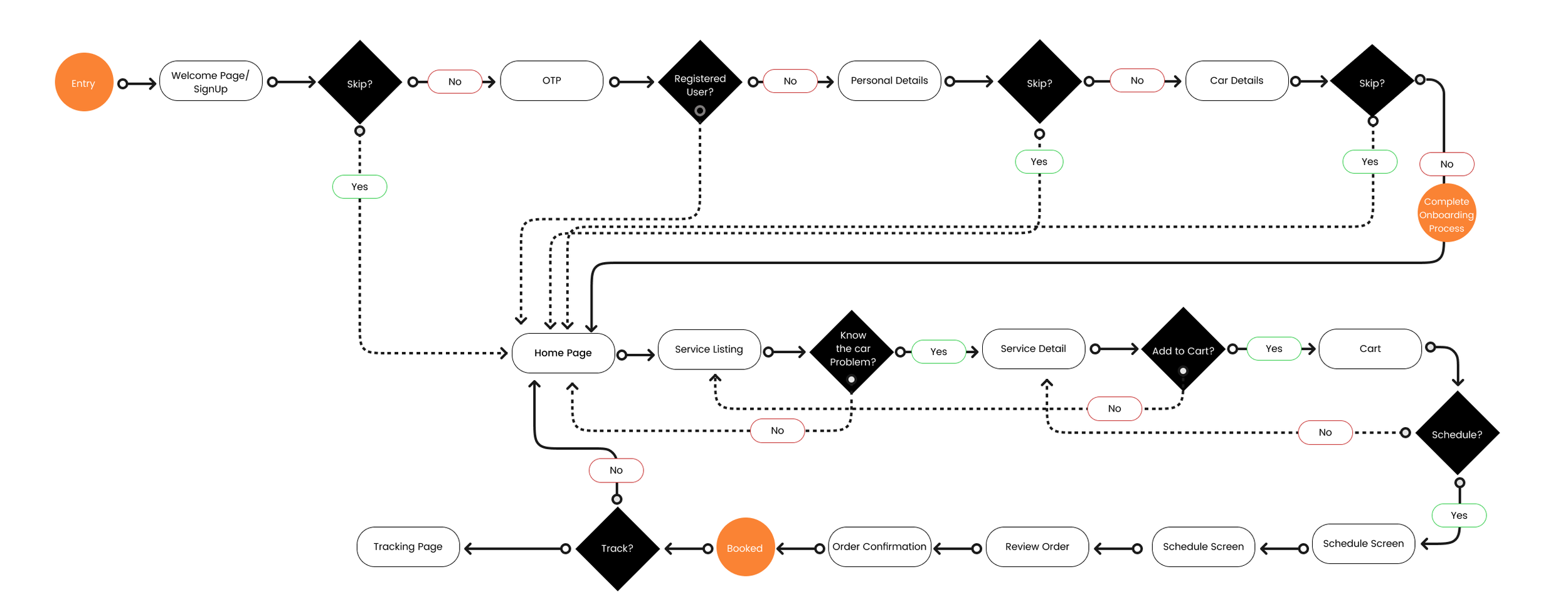
Mapping Convenience
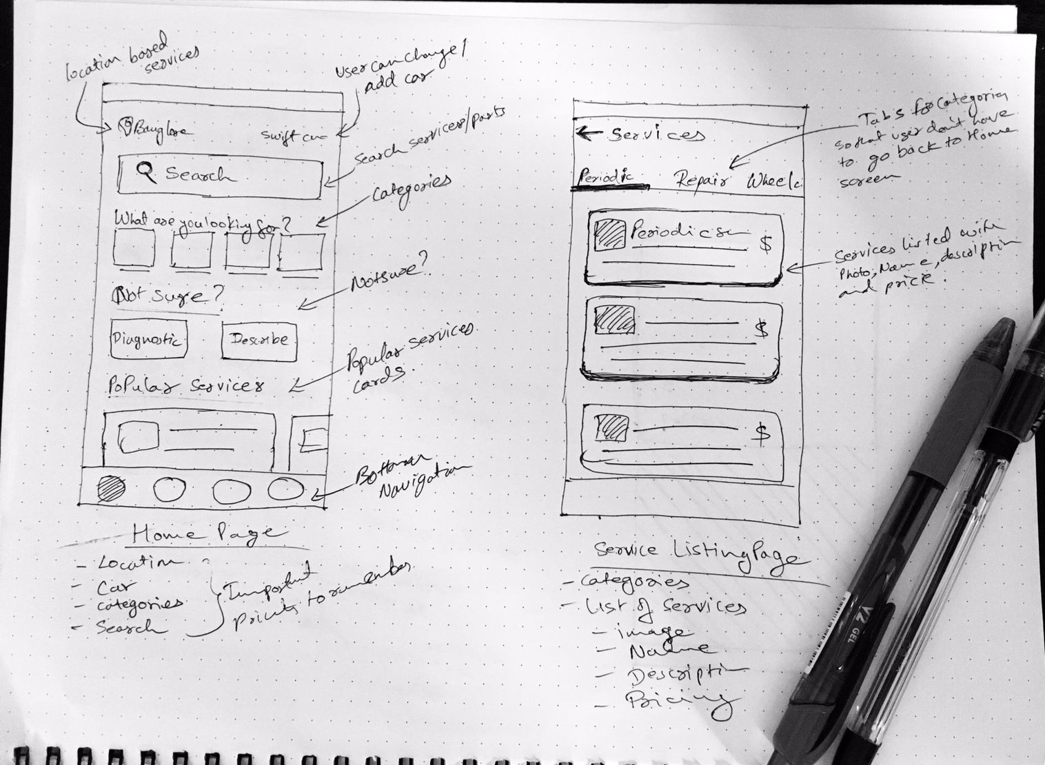
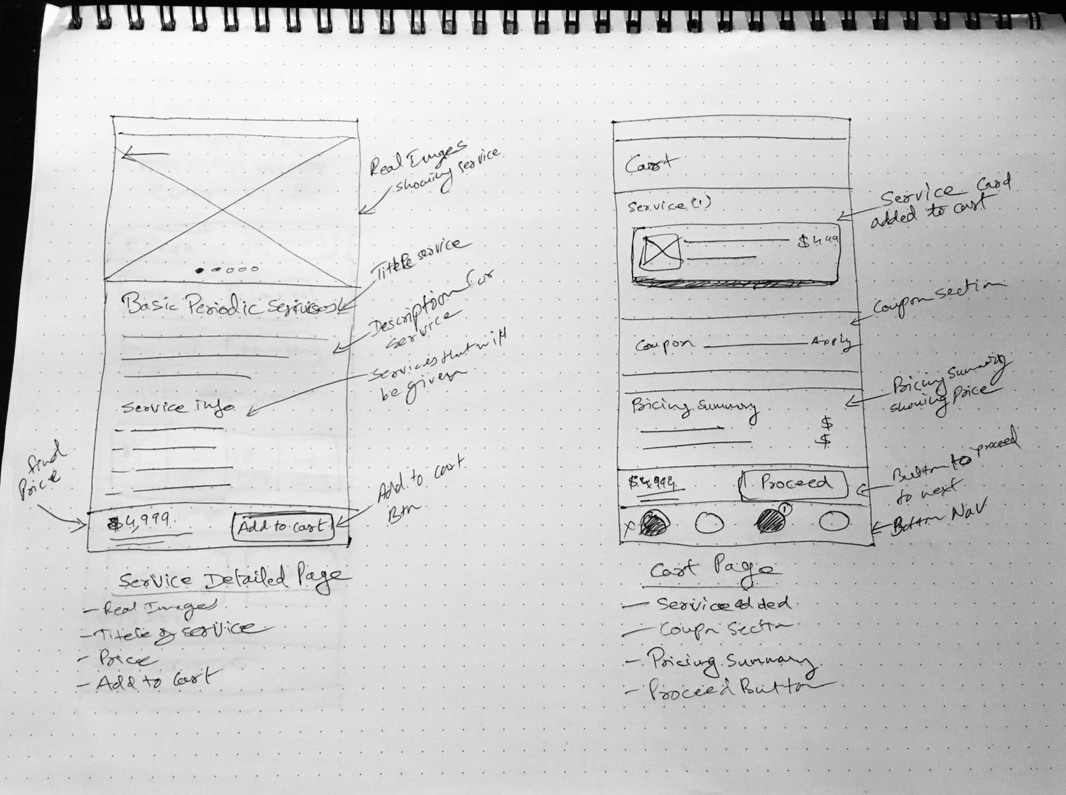
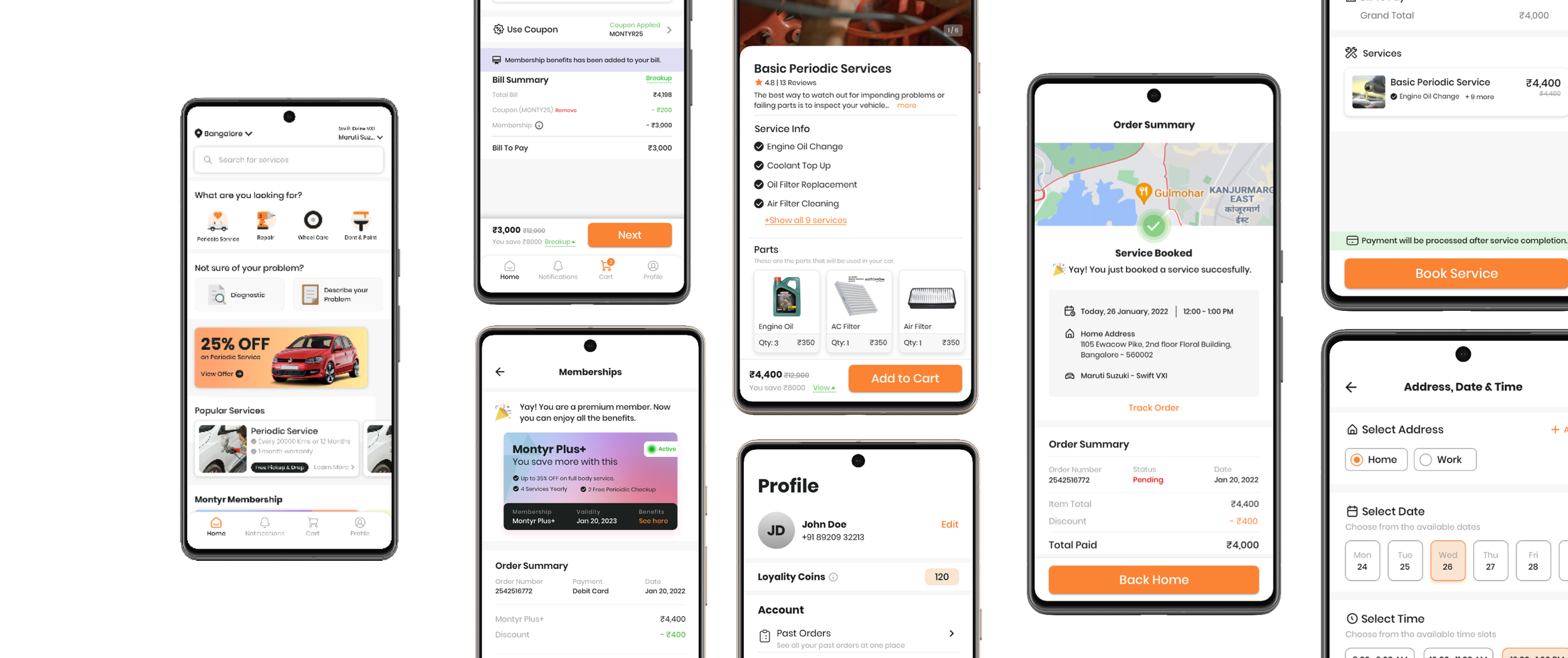
Our main focus was on the booking flow — how Sarah gets from selecting a service to completing the booking. We visualized transparency in pricing, real-time updates, and effortless booking on paper first.
From Concept to Reality
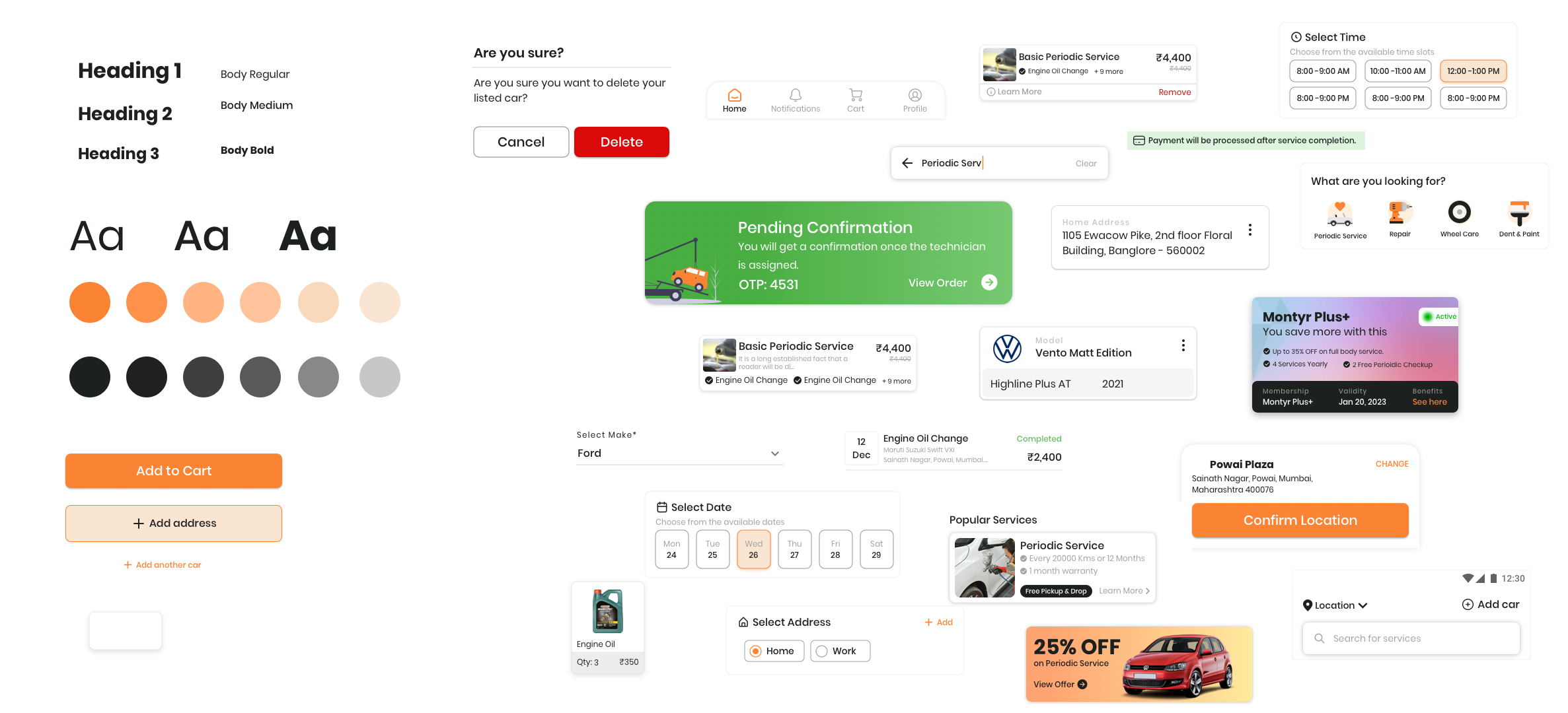
With research validated and flows finalized, we moved into high-fidelity design. The style guide established a cohesive visual language — ensuring every screen felt like part of the same product.
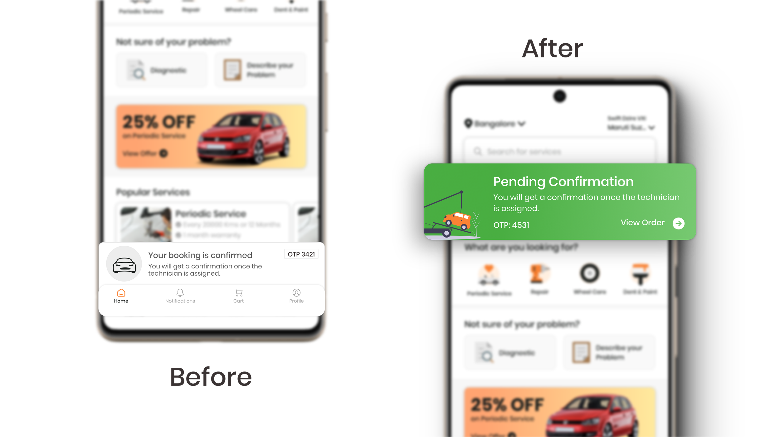
Live Status Card
Why we moved the card to the top
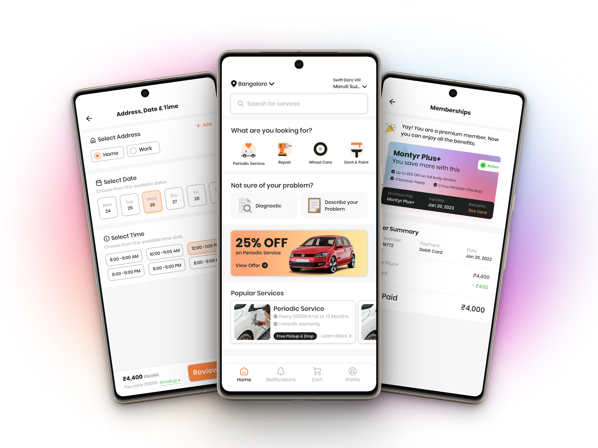
The Finished Product
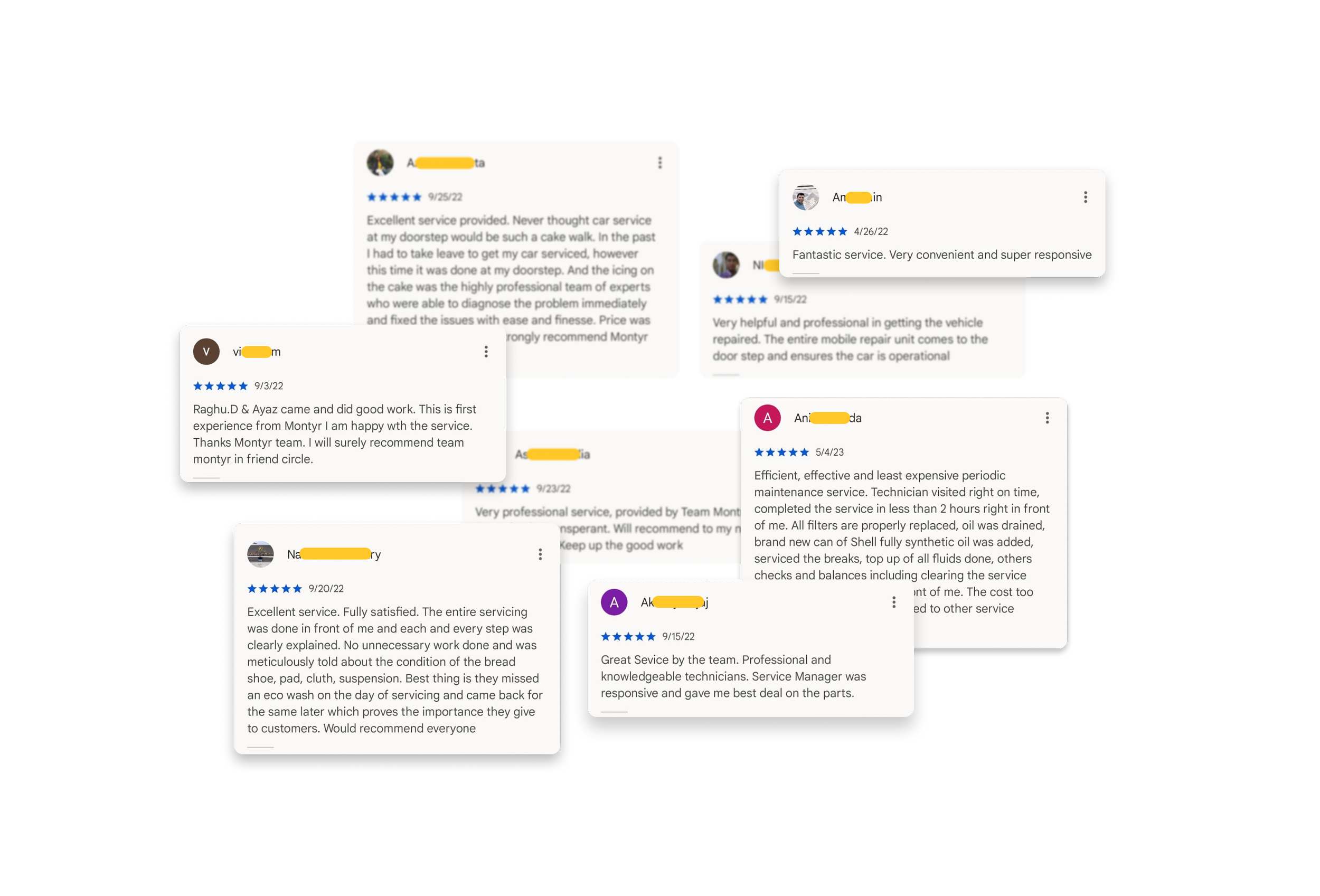
User Reviews
What I Learned
A Great Team
I felt so lucky to be a part of this growing team. I got a chance to work with Asad, who had previously worked as a Sr. Engineer at Square. Other team members were equally talented and experienced. In this company, I spoke more than I normally do and was more confident in making design decisions.
Empathy is Everything
The more you empathize with the user, the easier it gets to understand the problem. In the end, we are building for people — not for designers. No designer biases allowed 😄
Let's work together
Ready to bring your creative vision to life? We'd love to hear about your project and explore how I can help you achieve your goals.
Get in Touch