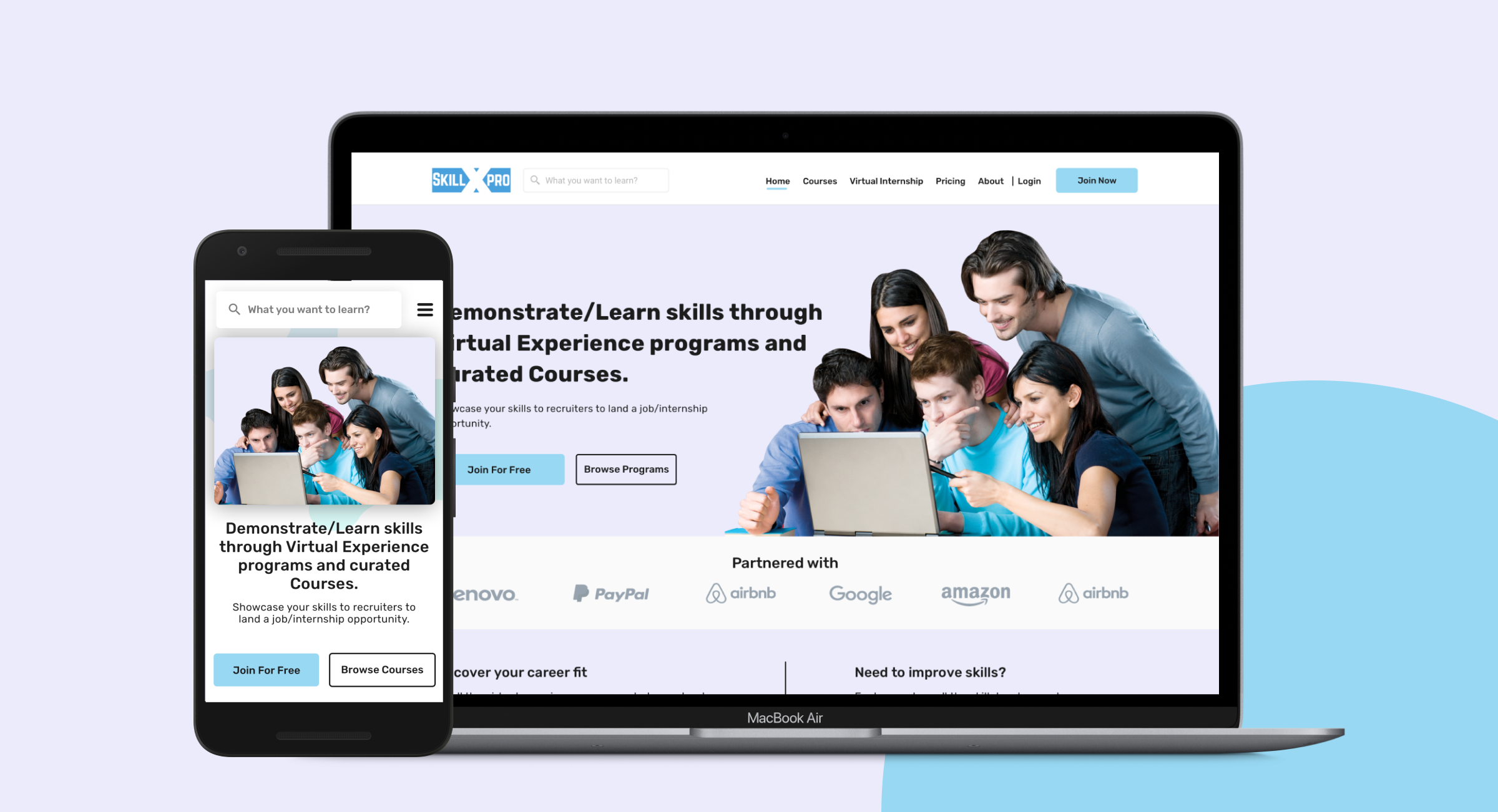
Redesigning SkillxPro for the modern learner.
An online skill development platform helping people improve their skills and land the jobs they aspire for.
Nov '19
to Jun '21
Product
Designer
Sole Designer
Research, Wireframing, Prototyping, Usability Studies, Visual Design using Sketch & Zeplin.
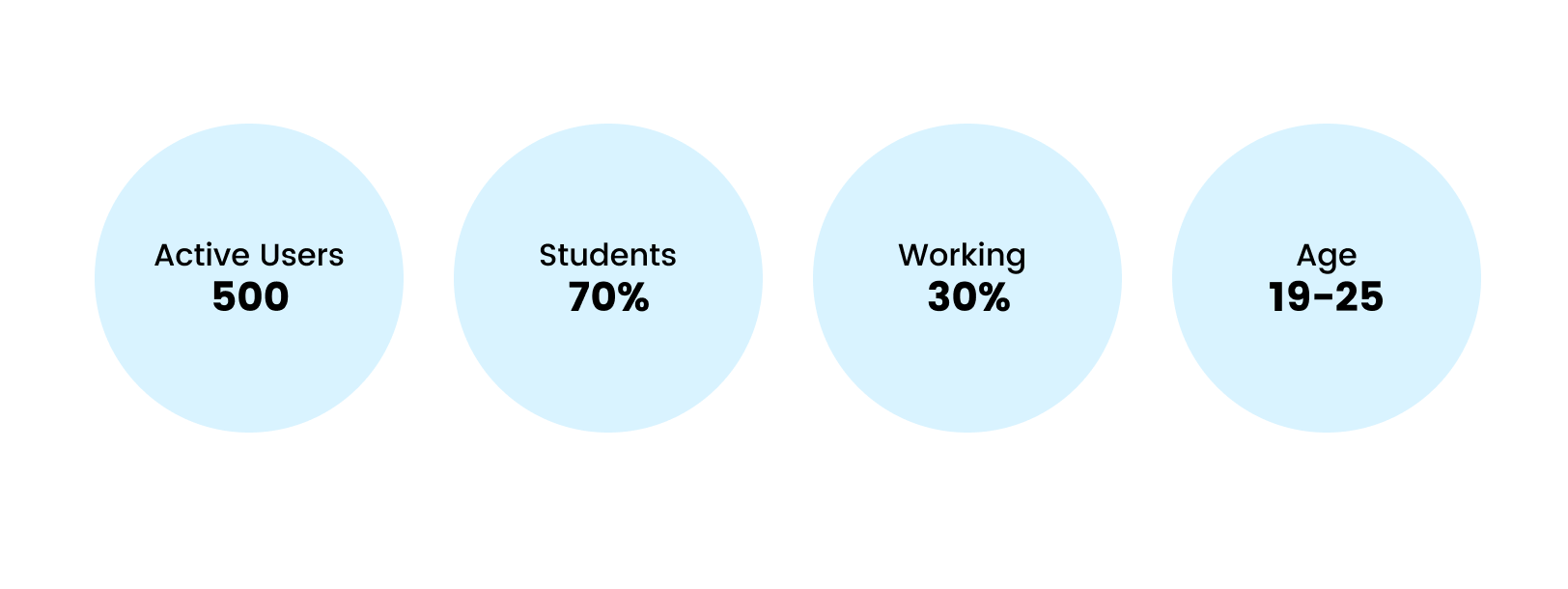
+20%
Increase in active users after 1.5 months.
User engagement was significantly better than before. Feedback started coming in during the first week of launch — users were happy not just with the new look, but with the entirely new experience throughout the platform.
Revamp under pressure
Our challenge was to revamp the SkillxPro website to create a seamless journey focusing on user flow — and to build a PWA app for the same product, all within tight time constraints.
Understanding the Landscape
I had in-depth discussions to understand the stakeholder's vision. I then went through all the reviews and feedback users had left on the platform — this proved to be the fastest way to identify real pain points given the time constraint.
My research also found a 60% bounce rate on the website — a critical signal that the experience was falling short of expectations.
What was broken?
Outdated UI
The UI was not modern, making users feel the platform was untrustworthy and dated.
Bad User Flow
A confusing navigation structure made the entire experience feel broken.
Poor Engagement
Users were dropping off from courses midway — engagement was critically low.
Limited Courses
There was only one course available at the time, giving users little reason to return.
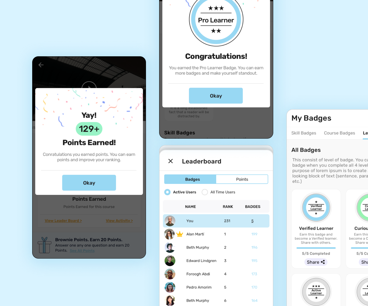
Introducing Gamification
This was the big step in making SkillxPro more appealing and engaging. We wanted it to be fun — not pressurising — so we made earning points as easy as completing a user profile.
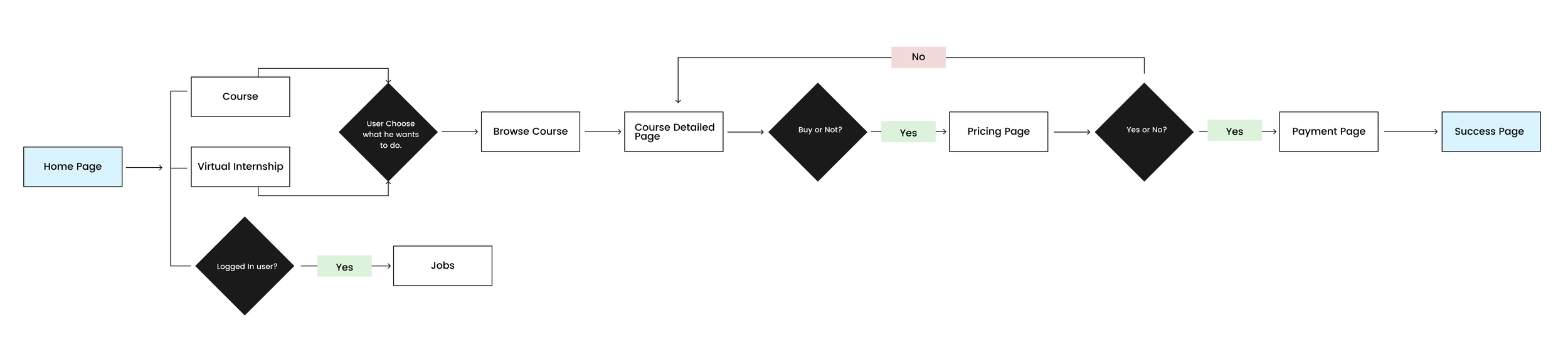
Mapping the User Flow
I broke the flow into parts: first the Course flow, then secondary flows for Jobs and Virtual Internships.
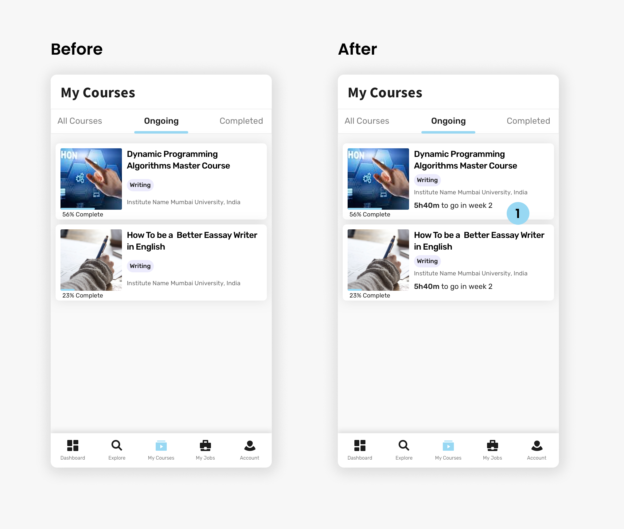
Targeted Changes
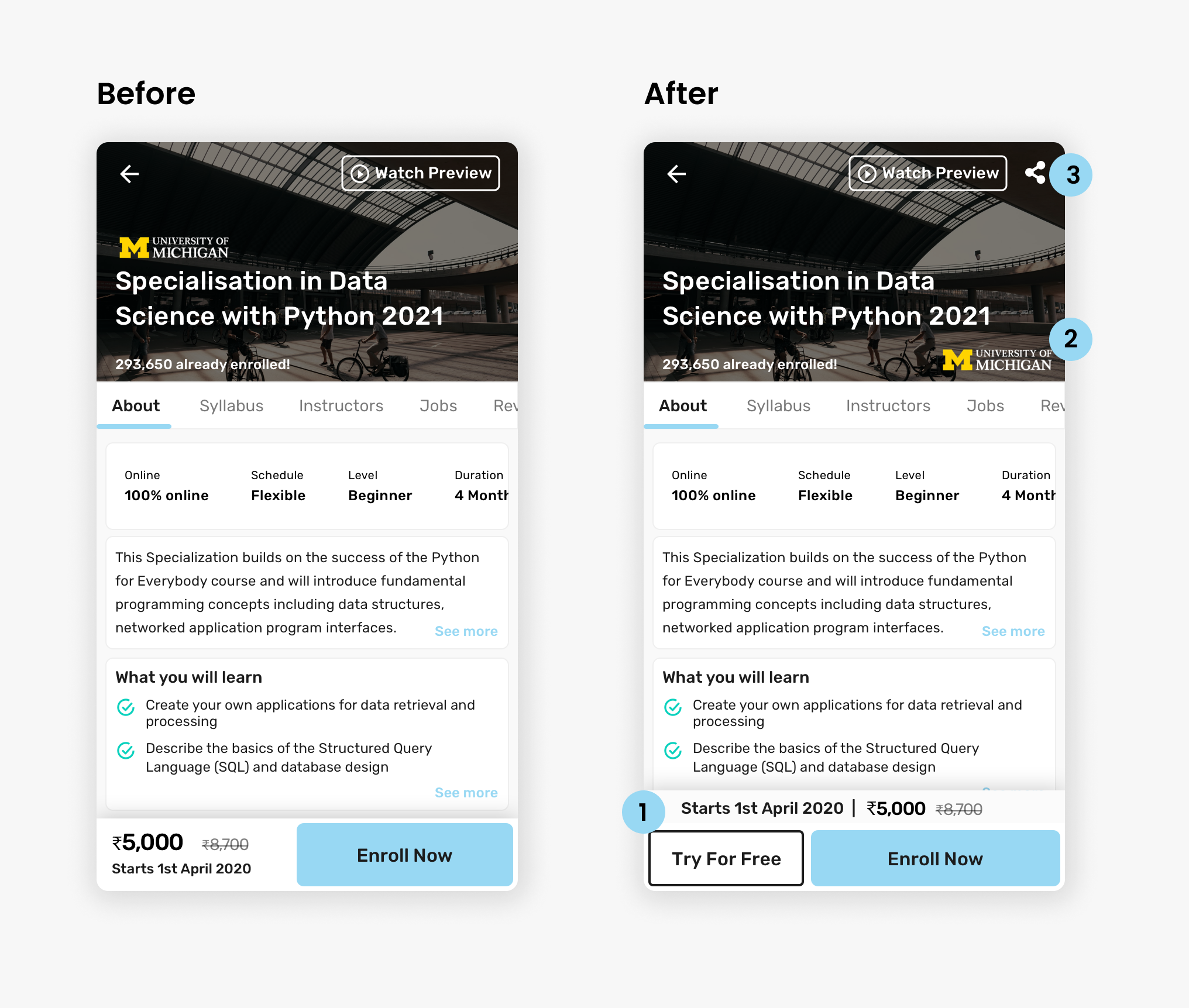
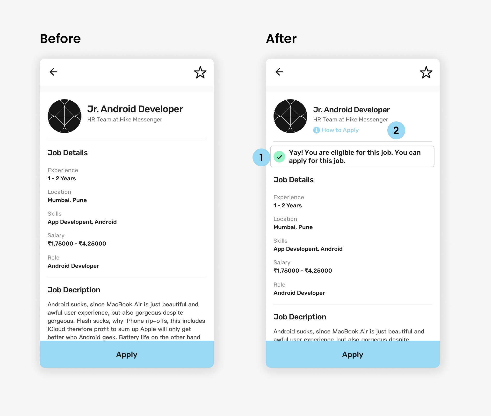
Eligibility & Transparency
Weekly Progress
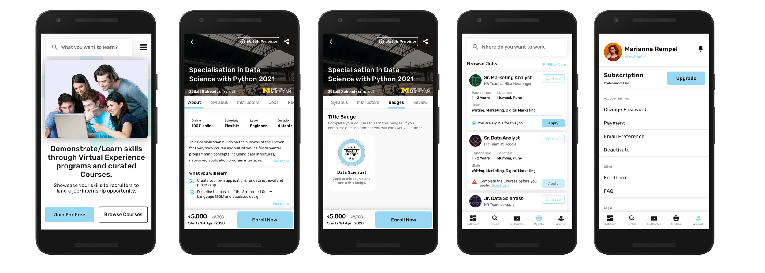
Courses — PWA Designs
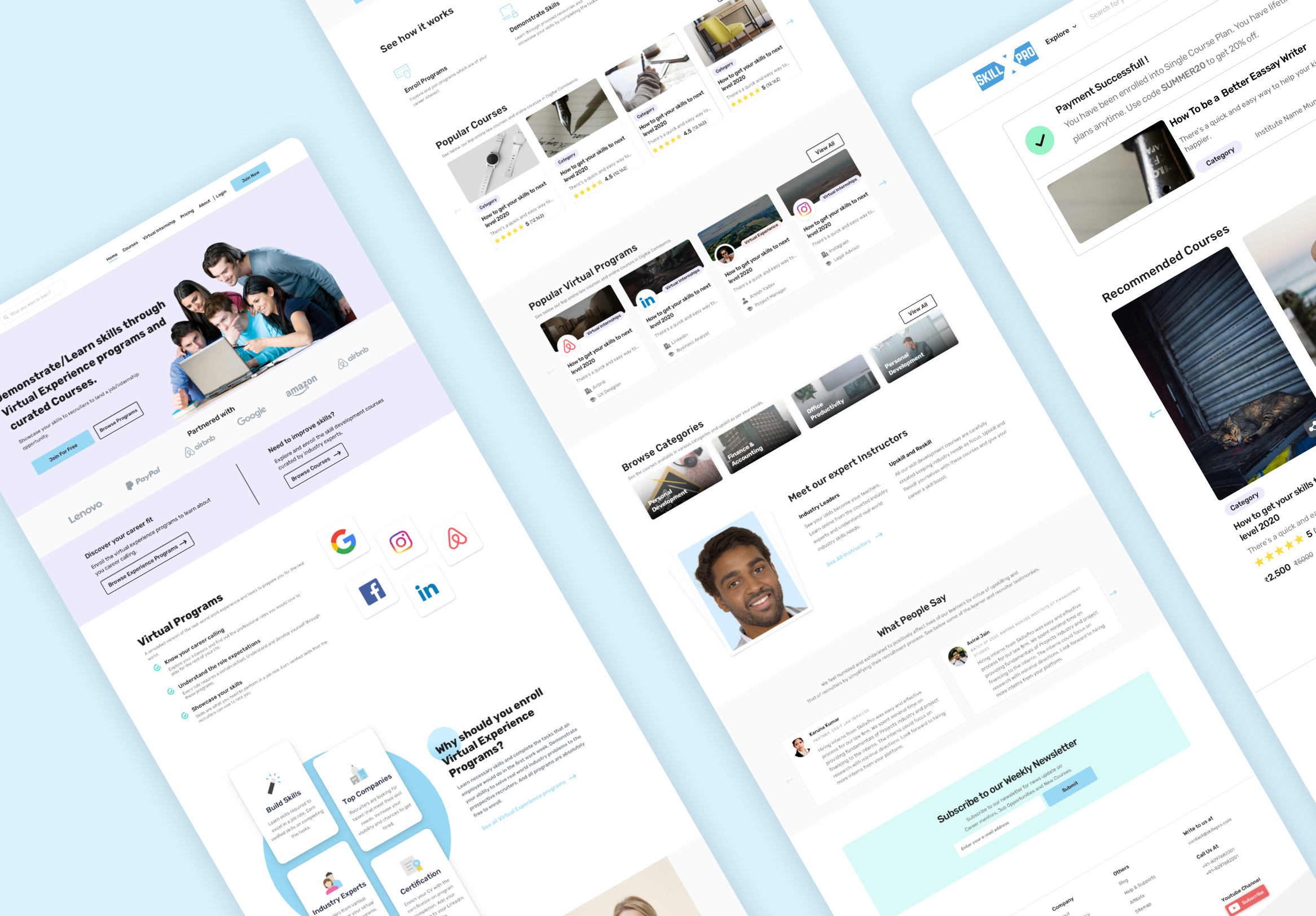
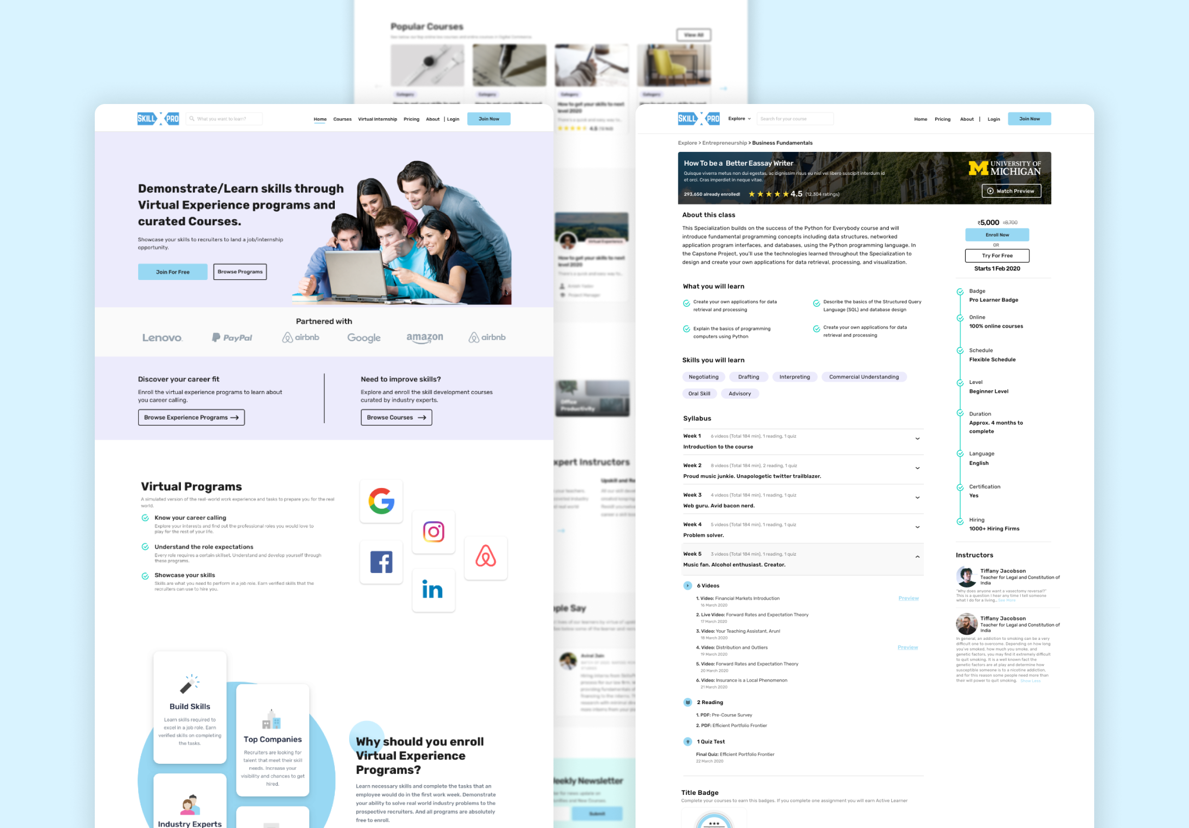
Website — Landing Page
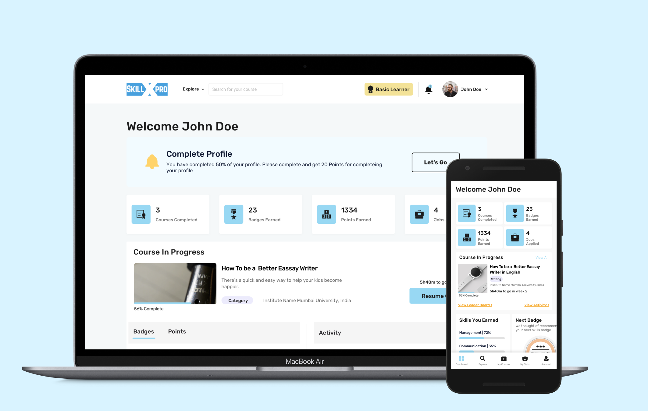
Students Dashboard & PWA
What I Learned
Gamification Changes Everything
Working on the gamification feature gave me a whole new perspective on how Ed-Tech can be made genuinely fun. Points, badges, and leaderboards aren't just gimmicks — when thoughtfully designed, they're powerful motivators that keep learners coming back.
Speed Doesn't Mean Shortcuts
Designing a full platform revamp plus a PWA in under 4 months as the sole designer taught me how to prioritize ruthlessly. Paper wireframes and quick digital prototypes helped catch issues early — saving time and ensuring quality at every stage.
Let's work together
Ready to bring your creative vision to life? We'd love to hear about your project and explore how I can help you achieve your goals.
Get in Touch