
An online consultation app would allow patients to consult with doctors remotely through video or chat.
Project Overview
My Role
Product Designer
Responsibility
Research, Wireframing, low and high-fidelity Prototyping, Conducting Usability Studies, and Visual Design(UI).
Timeline
July 2020 - August 2020
Tools
Sketch, Pen & Paper
Opportunity
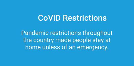
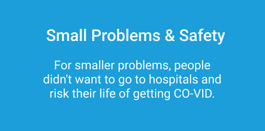
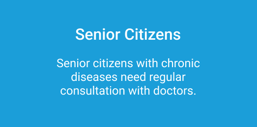
During the pandemic(Co-VID 19), many people were stuck inside houses and did not have access to hospitals or even clinics. Also, People with chronic diseases need regular checkups.
Goal
Design an app that allows users to easily book appointments with doctors for online consultation.

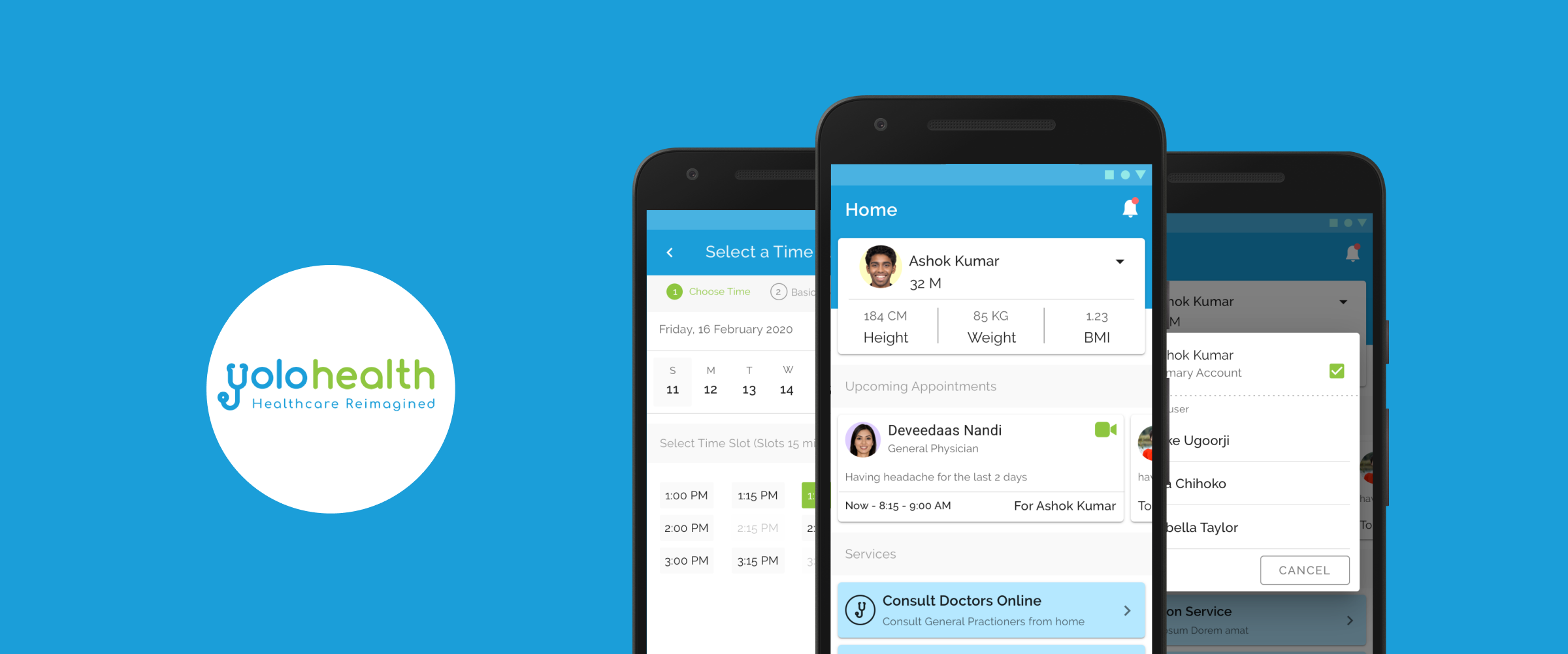
Final Design
Business Objective
Create an app to book a consultation online for current users and attract new users. It would be easy for users to consult doctors online for small minimal problems.
Traget New User
To Deal with CoVID Restrictions
Increase Customer Satisfaction
Key Constraints
We had a time constraint of about 1.5 months to ship the product with very little resources.
Research
Competitive Analysis
Due to time constraints, I immediately thought to study other applications and their already existing features. I directly jump to the analysis of existing competitors and extract important features. The purpose of this analysis was to understand the features and main booking flow.
User Research
After interviewing some of the users I identified some common pain points.
Key Points
Easy navigation for those who are not tech-savvy
Clear Text so people don’t get confused
The flow should be easy to understand
Booking flow should be fast and quick without any distraction
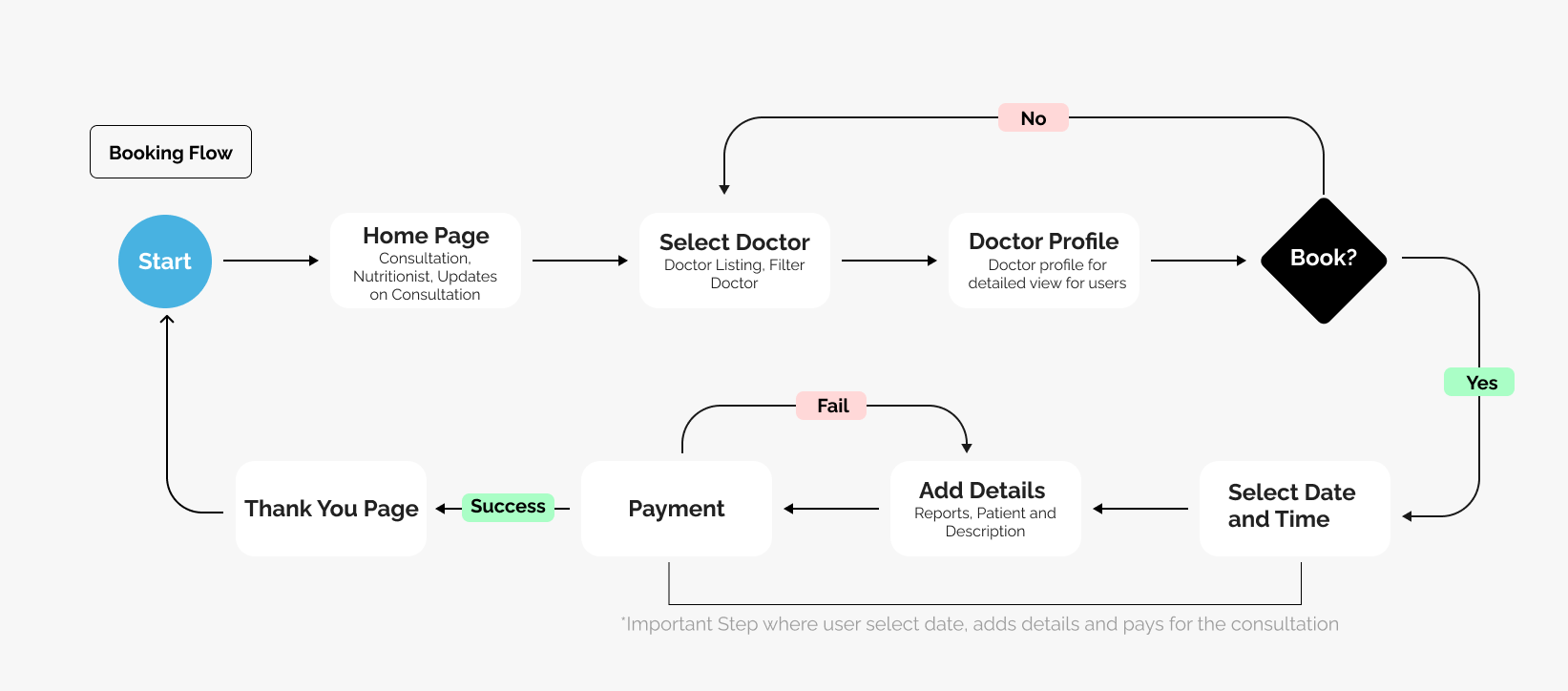
User Flow
I decided to design and own the user flow for the app to see how the user will go on booking a consultation. I wanted to remove the unnecessary thing that could potentially slow down the booking process.
Paper Wireframes
I started with paper wireframes sketching out the booking flow. This gave me the opportunity to try different ideas. But it had to be a quick due to time constraint.


Digital Wireframes
I brought all the paper wireframes and converted them into lo-fi digital wireframes.
Iterations
As I showed the lo-fi digital wireframes to the stakeholders and got some feedback for the same. I incorporated the feedback that I thought was important and made an impact on the user flow.
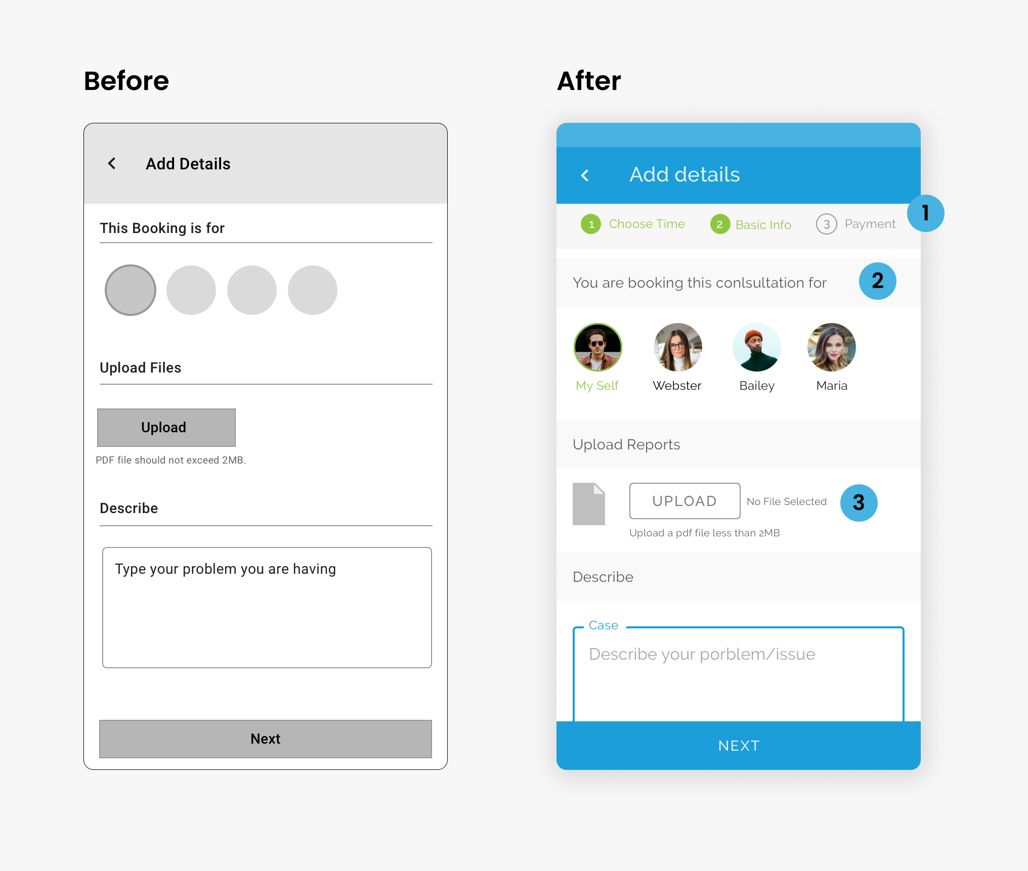
Add Details Page
Added a stepper so that users know what is the next step.
Changes the text for more clarity
Added text for upload file so that user knows if he has uploaded a file.
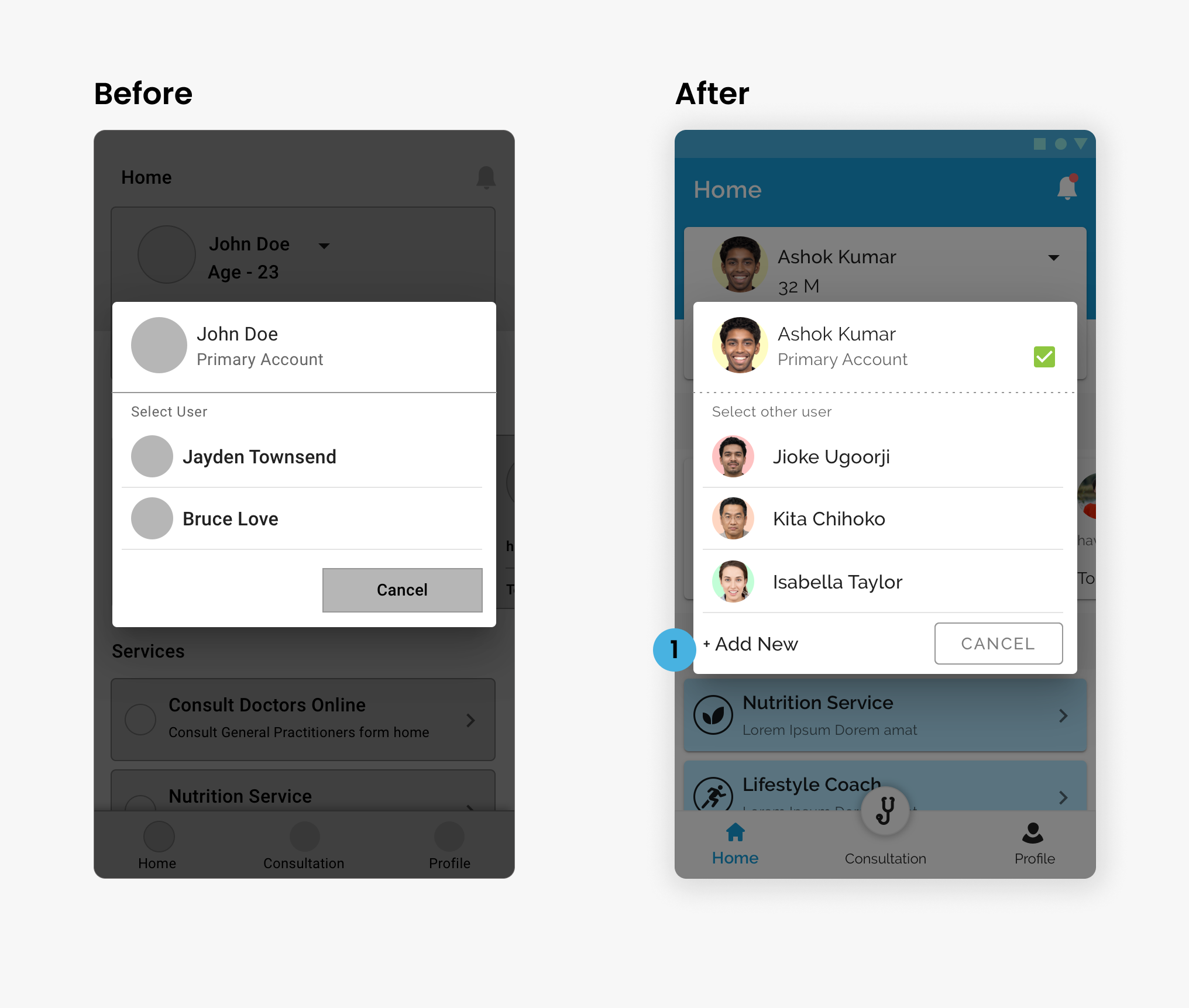
Select User Screen
Added “Add New”. Now user can be added from the Select User Popup
Select Time Slot Page
Added Text for Slots time so that users know how much time they will be on a call.

Payment Page
Doctor and Patient Info in a single line
Discount Code link
Consent option before they proceed to pay.

Booking Confirmation Details Page
Summary - Details for users to see consultation details
Amount Paid - User can see the paid amount.
Final Design
The UI Kit was purchased by the client so didn’t have to do a lot of UI which saved me a ton of time. Here is the final design.
Takeaways
Although the app never saw its official launch, the journey of working on it during a global pandemic was incredibly fulfilling. Being part of a team dedicated to addressing a challenge faced worldwide brought a sense of purpose. There are no regrets; it was a meaningful endeavor."