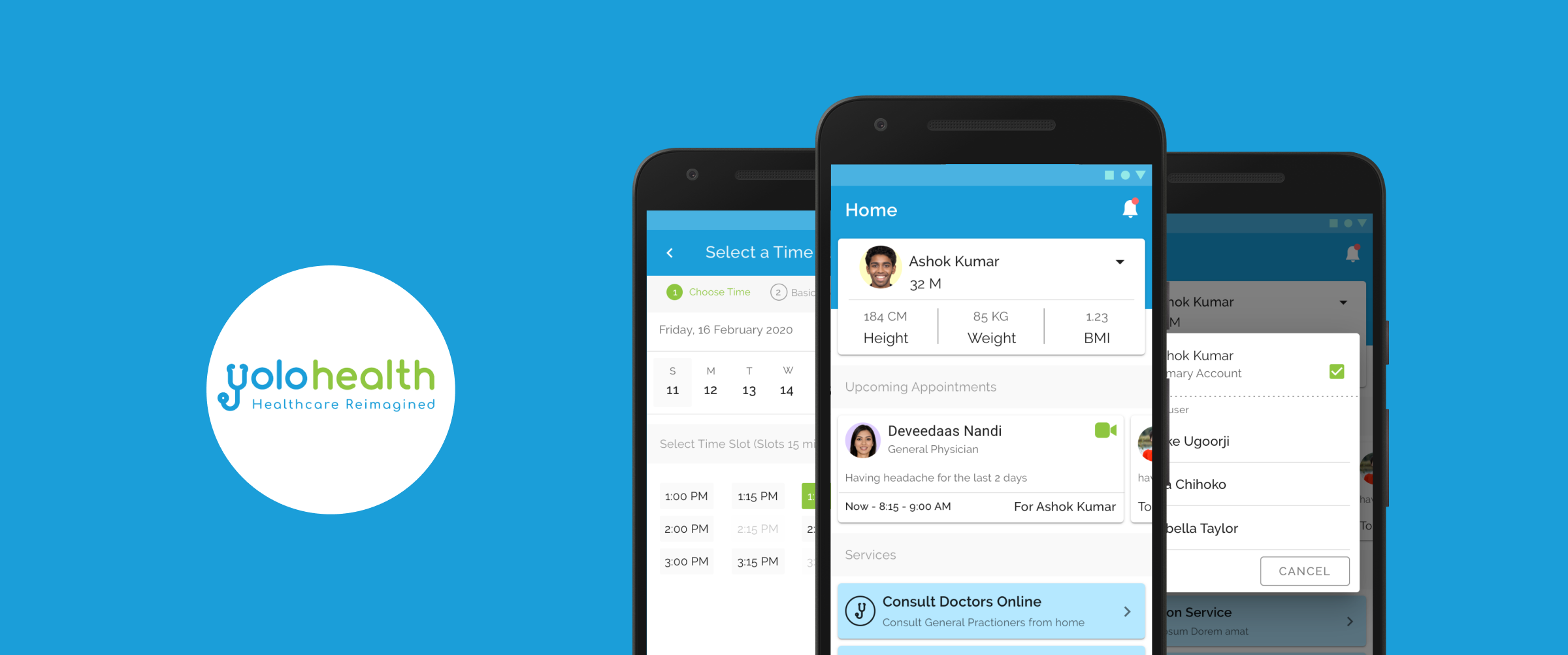
Connecting patients to care with YoloHealth.
An online consultation app allowing patients to seamlessly consult with doctors remotely through video or chat.
Jul '20
to Aug '20
Product
Designer
End-to-End Design
Research, Wireframing, Prototyping (Low & High-Fidelity), Usability Studies, and UI Visual Design using Sketch.
The Opportunity
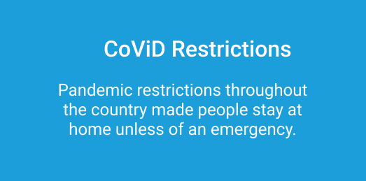
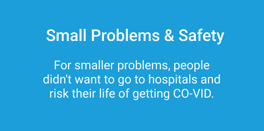
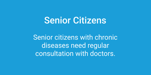
During the Co-VID 19 pandemic, many people were stuck inside their houses and did not have access to hospitals or clinics. Furthermore, people with chronic diseases who needed regular checkups were left isolated.
Goal: Design an app that allows users to easily book appointments with doctors for online consultation.
1. Target New Users
Attract individuals seeking safe, remote healthcare.
2. Navigate Restrictions
Provide a vital service safely during global lockdowns.
3. Fast Execution
Strict constraint to ship the product within 1.5 months.
Understanding the Landscape
Due to time constraints, I immediately jumped into a competitive analysis of existing applications. The goal was to understand core features and the main booking flow without reinventing the wheel.
After interviewing users, we identified key requirements for a successful medical app:
Easy Navigation
Essential for patients who may not be tech-savvy.
Clear Text
Direct copy so people don’t get confused during stress.
Simple Flow
The entire process should be logical and easy to understand.
Distraction Free
Booking flow must be fast, quick, and highly focused.
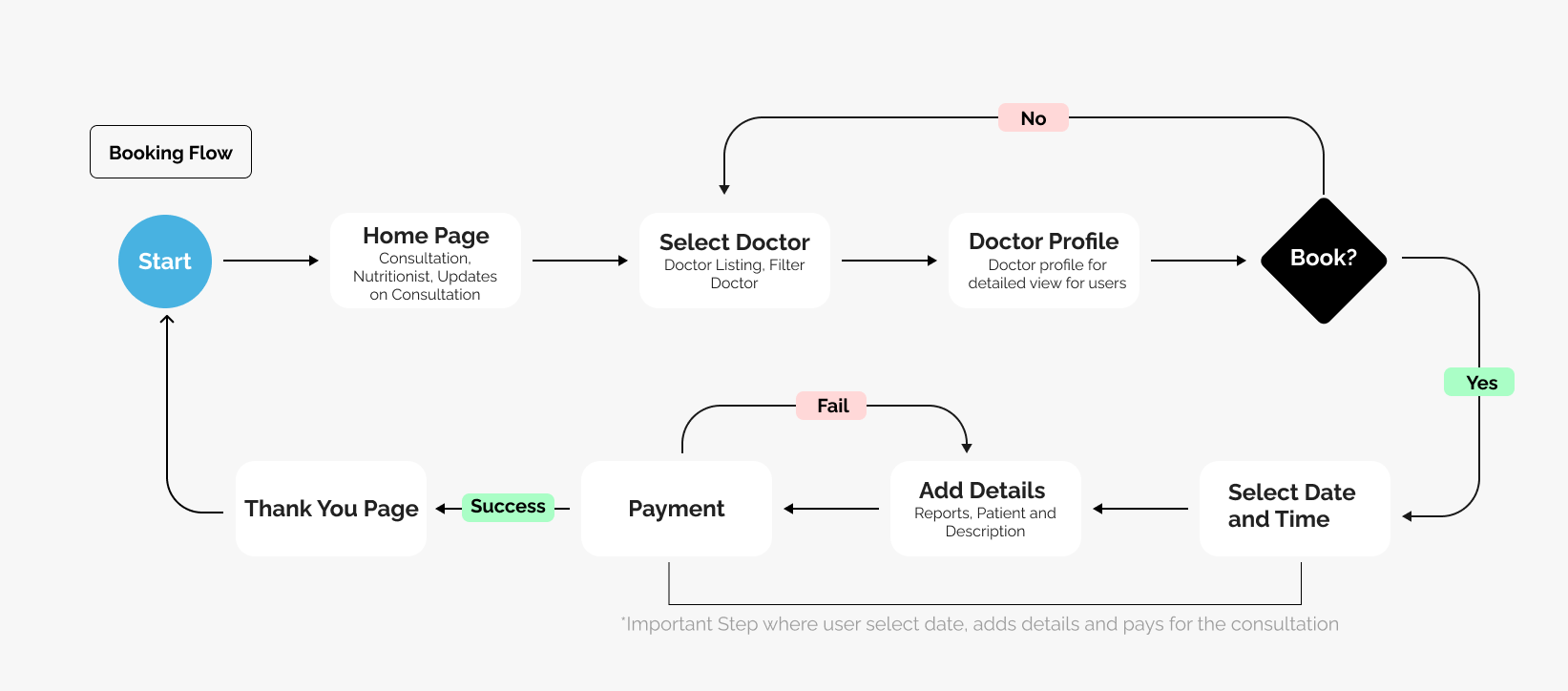
User Flow
I decided to design and own the user flow for the app to see how the user will go about booking a consultation. I wanted to remove any unnecessary steps that could potentially slow down the booking process.
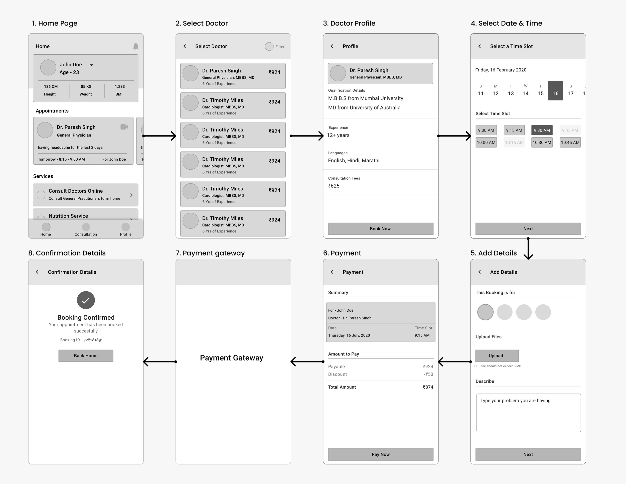
Digital Wireframes
I brought all the paper wireframes into Sketch and converted them into lo-fi digital wireframes to establish the structural hierarchy before applying visual design.
Stakeholder Feedback & Iterations
As I showed the lo-fi digital wireframes to the stakeholders, I gathered immediate feedback and incorporated changes that made a significant impact on the user flow.
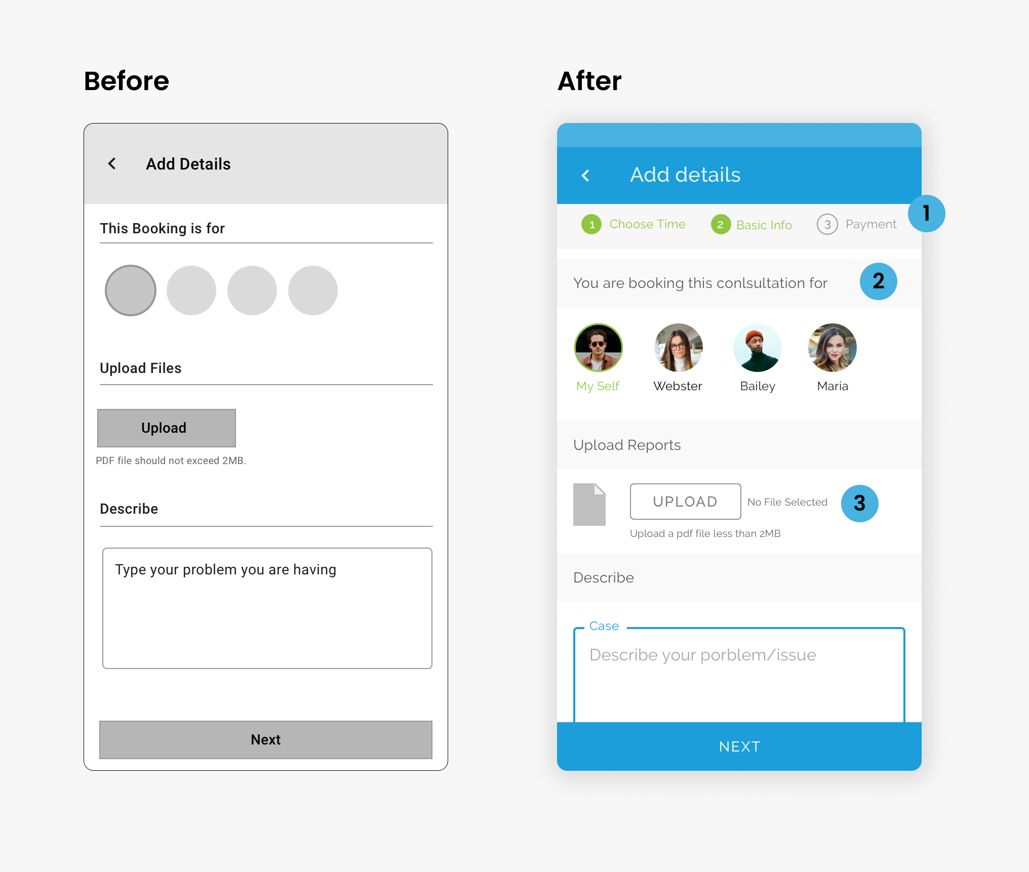
Add Details Page
- Added a stepper so users know the next step.
- Changed text for more clarity.
- Added state text for file uploads so users know when a file is attached.
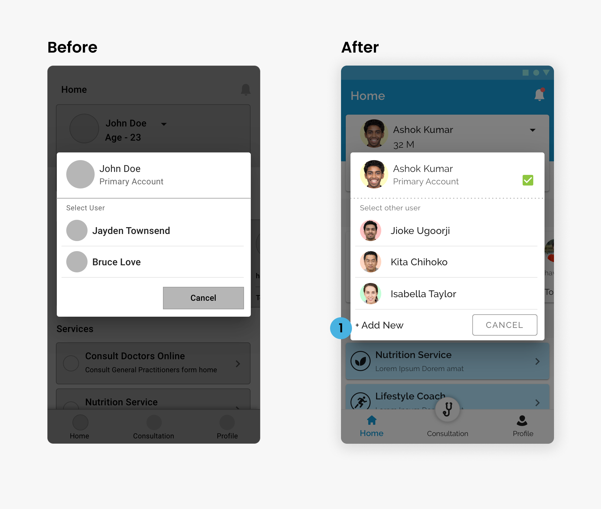
Select User Screen
- Added "Add New" functionality directly inline.
- Users can now be seamlessly added directly from the Select User Popup.
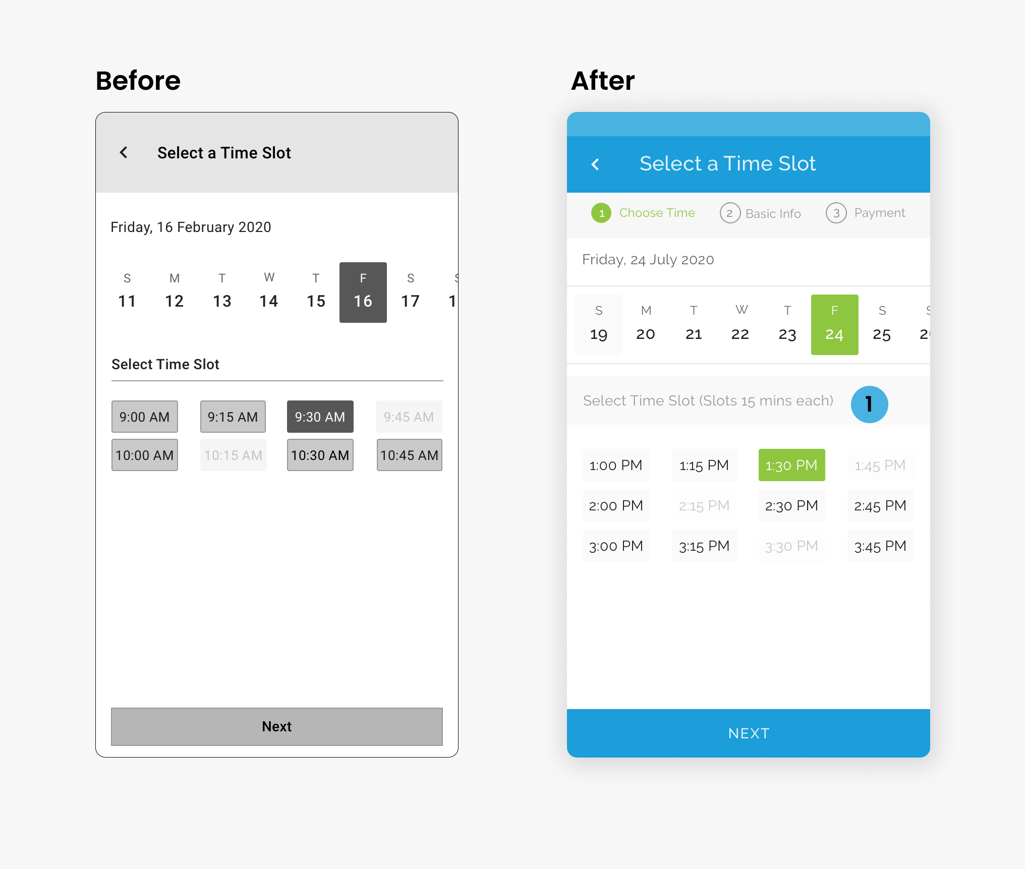
Select Time Slot
- Added explicit duration text for time slots.
- Users now know exactly how much time they will be on the consultation call.
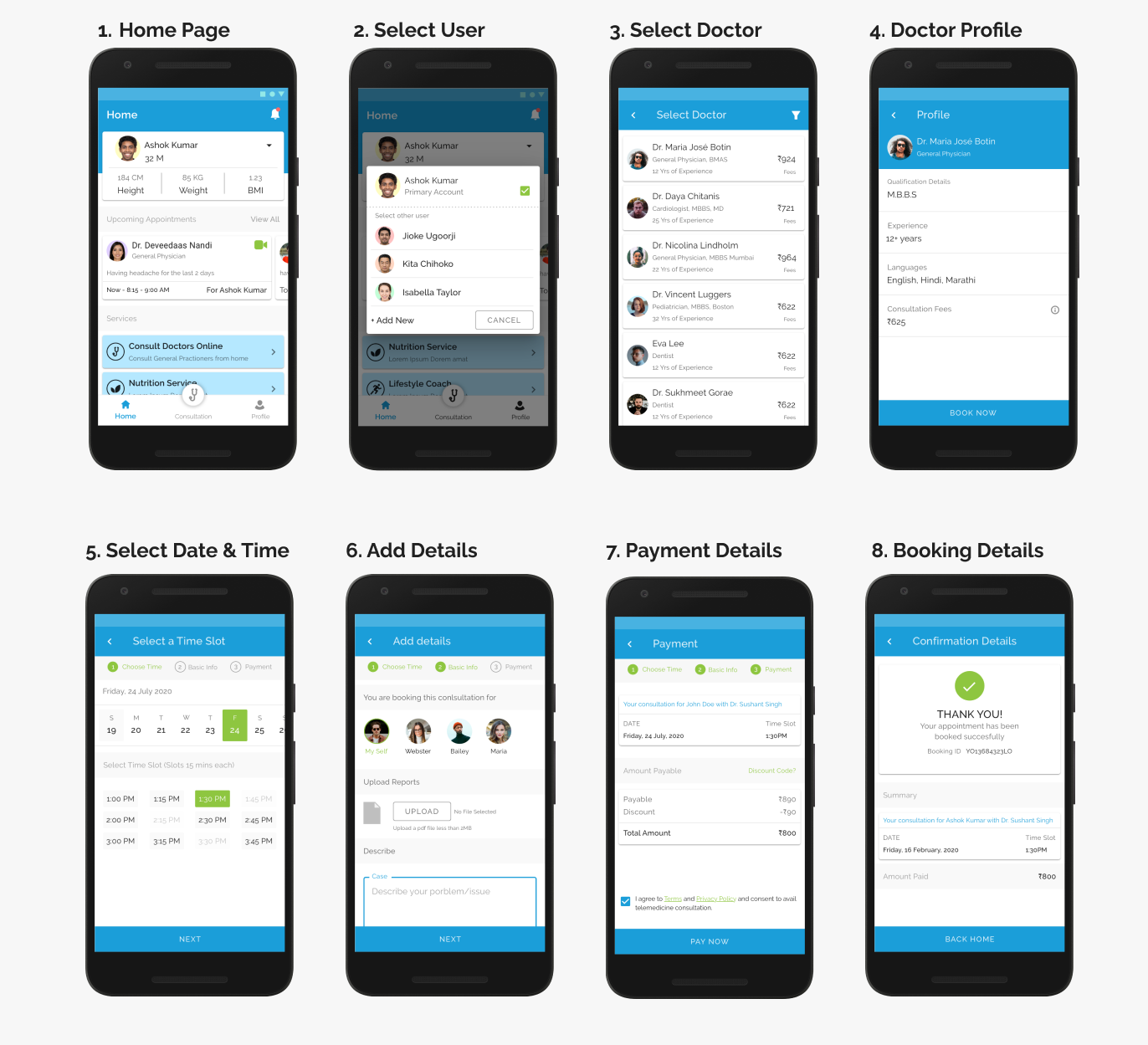
The Final Product
A UI Kit was purchased by the client, so I focused primarily on layout execution and adapting the components to our specific user flows, which saved a ton of time during the tight 1.5 month sprint.
Takeaways
Although the app never saw its official launch, the journey of working on it during a global pandemic was incredibly fulfilling. Being part of a team dedicated to addressing a health challenge faced worldwide brought a deep sense of purpose. There are no regrets; it was a highly meaningful endeavor.
Let's work together
Ready to bring your creative vision to life? We'd love to hear about your project and explore how I can help you achieve your goals.
Get in Touch